With 2023 just around the corner, it’s time to start thinking about the trends that will dominate in the coming year. From sleek and minimalistic styles to bold and daring designs, there’s something for everyone in this exciting era of digital aesthetics. So buckle up and get ready as we explore the top web design trends that are set to conquer screens everywhere in 2023. Get ready for a visual feast like no other!
Ghost Buttons
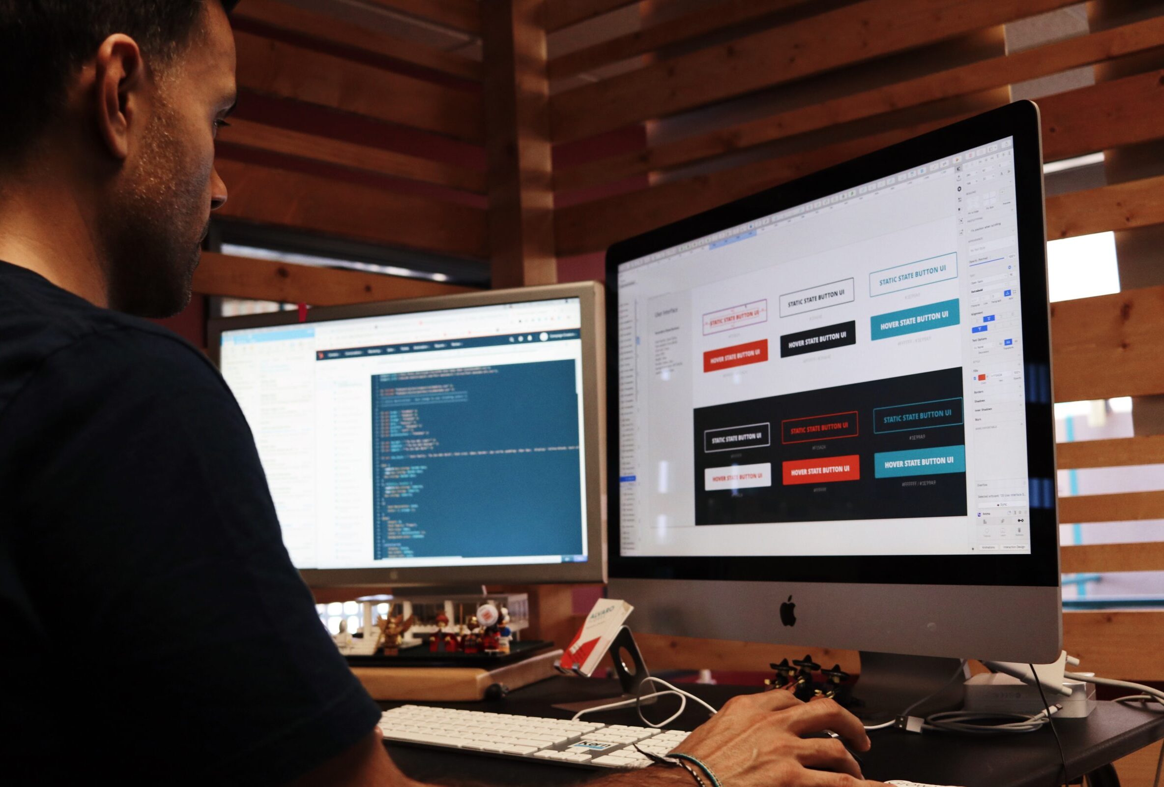
When it comes to web design, sometimes less is more. And that’s where ghost buttons come into play. These transparent and subtle call-to-action buttons have been gaining popularity in recent years, and they show no signs of slowing down in 2023.
The beauty of ghost buttons lies in their simplicity. Unlike traditional solid-colored buttons, these ethereal gems blend seamlessly with the surrounding background, creating an air of elegance and sophistication. They don’t overpower the page but instead serve as a gentle prompt for users to take action.
But don’t mistake their subtlety for insignificance! Ghost buttons are anything but invisible when it comes to user engagement. Their clean lines and delicate outlines draw attention without being obtrusive or distracting from the overall design aesthetic.

Moreover, ghost buttons offer versatility like no other button style can. Whether you’re designing a sleek corporate website or a trendy e-commerce store, these understated elements effortlessly adapt to any branding or theme.
So if you want your website to exude modernity while keeping things visually light, consider incorporating ghost buttons into your design arsenal. With their minimalist charm and timeless appeal, these transparent treasures are sure to captivate visitors and enhance the user experience in 2023 – all with just a hint of magic!
Brutalism
Brutalism is a web design trend that has been gaining popularity in recent years. It’s all about embracing raw and unfinished aesthetics to create a bold and unconventional online presence. With its stark typography, geometric shapes, and monochromatic color schemes, Brutalism challenges traditional design principles and pushes boundaries.
One of the key characteristics of Brutalist web design is its minimalistic approach. By stripping away unnecessary elements and focusing on essential features, websites created in this style are able to convey a sense of authenticity and simplicity. This stripped-down approach can be seen in the use of large-scale typography, plain backgrounds, and unadorned layouts.
Another defining aspect of Brutalism is its emphasis on functionality over aesthetics. Instead of striving for seamless perfection, these designs often embrace imperfections as part of their charm. They may incorporate rough edges or intentionally misaligned elements to add character and provoke an emotional response from users.

In terms of user experience (UX), Brutalist websites tend to prioritize content above all else. The focus is on delivering information quickly and efficiently without distractions or unnecessary embellishments. This straightforward approach can result in faster loading times and improved accessibility for visitors.
It’s worth noting that while most popular web design trends aim for sleekness and polish, Brutalism stands out by deliberately going against the grain with its raw aesthetic appeal. As we continue into 2023, it will be interesting to see how designers push the boundaries even further with this daring style!
Flat Design
Flat design has been a popular web design trend for several years now, and it shows no signs of slowing down in 2023. This minimalist approach to design focuses on simplicity and clarity, using clean lines, bold colors, and ample white space.
One of the key advantages of flat design is its ability to load quickly on various devices and screen sizes. By eliminating unnecessary elements like shadows and gradients, flat design creates a lightweight user experience that is both visually appealing and fast-loading.
Another benefit of flat design is its versatility. It can be easily adapted to different branding styles and aesthetics, making it suitable for a wide range of industries. Whether you’re designing a website for an e-commerce store or a creative agency, flat design provides a sleek and modern look that resonates with users.
Furthermore, flat designs often feature intuitive navigation menus and clear call-to-action buttons. With minimal distractions, users can focus on the most important elements of your website without feeling overwhelmed or confused.
Long Scrolling
In the world of web design, long scrolling has become increasingly popular in recent years. With the rise of mobile devices and smaller screens, users have grown accustomed to scrolling through content rather than clicking on multiple pages. This trend is expected to dominate in 2023 as designers continue to prioritize user experience.
One of the main advantages of long scrolling is its ability to tell a story or convey information in a seamless and engaging way. By presenting content in a linear fashion, users can simply scroll down the page to discover more without having to navigate through complex menus or search for specific sections.
Another benefit of long scrolling is its compatibility with various types of media. Whether it’s text, images, videos, or interactive elements, all can be easily integrated into a single scrollable page. This allows designers to create visually stunning and immersive experiences that captivate users from start to finish.
Furthermore, long scrolling encourages engagement by leveraging techniques such as parallax effects and animations. These subtle yet impactful visual cues not only enhance the overall aesthetic appeal but also provide an element of interactivity that keeps users interested and involved.
However, it’s important for designers to strike a balance between providing enough content within each section while avoiding overwhelming users with excessive amounts of information on one page. Careful consideration should be given to organizing content into logical sections that are easy for users to digest while maintaining a cohesive flow throughout.
In conclusion (no conclusive tone), long scrolling offers numerous advantages for both designers and users alike. Its ability to create immersive storytelling experiences combined with its compatibility across different devices make it an effective technique that will continue dominating web design trends in 2023.
Card-Based Layouts
Card-based layouts have become a popular trend in web design, and it’s no surprise why. This type of layout offers a visually appealing and organized way to present content to users. By breaking information into bite-sized chunks or “cards,” websites can create an engaging and interactive user experience.
One of the main advantages of card-based layouts is their flexibility. These cards can contain various types of content such as images, text, videos, or links. They can be easily rearranged or resized depending on the screen size or user preference, making them responsive and adaptable.
Furthermore, card-based layouts enhance user engagement by allowing for easy navigation through different sections of a website. Users can simply swipe left or right to explore more cards without being overwhelmed by excessive information all at once.
From an aesthetic standpoint, card-based layouts offer designers endless opportunities for creativity. With the ability to customize each card individually, they can choose unique colors, fonts, and imagery that suit the overall brand image.
In addition to their visual appeal and functionality benefits, card-based layouts also improve website performance and loading times since only specific cards need to load when requested by the user.
Card-based layouts are here to stay in 2023 as they provide a seamless blend of form and function that enhances both user experience and visual aesthetics on websites across various industries. So keep an eye out for this trend as it continues dominating web design in the coming years!
Microinteractions
In the ever-evolving world of web design, it’s crucial to stay ahead of the curve and embrace emerging trends. One such trend that is set to dominate in 2023 is microinteractions. These subtle yet impactful design elements have become increasingly popular for their ability to enhance user engagement and delight.
So, what exactly are microinteractions? They are those small, well-crafted moments that happen within a website or an app. From simple hover effects to animated button clicks, these tiny interactions provide feedback and guidance to users as they navigate through a digital experience.
One of the main reasons why microinteractions are gaining popularity is their ability to create a sense of connection between the user and the interface. By adding playful animations or providing visual cues when completing an action, designers can make users feel more engaged with their website or app.
Not only do microinteractions improve usability, but they also add personality and depth to a digital product. Whether it’s a subtle loading animation or a cleverly designed progress bar, these delightful details can leave a lasting impression on users.
Furthermore, implementing microinteractions can help streamline complex processes by breaking them down into digestible steps. For example, using interactive tooltips or guided tutorials can assist users in understanding how different features work without overwhelming them with information all at once.
When used strategically, microinteractions can contribute significantly towards creating intuitive interfaces that encourage exploration and interaction. They provide instant feedback that reassures users about their actions while ensuring seamless navigation throughout the site or application.
As we enter 2023 and beyond, integrating thoughtful microinteractions will play an essential role in captivating visitors’ attention while elevating overall user experiences across various digital platforms.
Stay tuned for more insights on other exciting web design trends coming your way!
Asymmetr
In the world of web design, asymmetry is making its mark as a trend that will dominate in 2023. Unlike traditional designs that strive for balance and symmetry, asymmetrical layouts challenge the norm by embracing imbalance and irregularity.
Using asymmetry in web design allows for greater creativity and uniqueness. It adds a sense of dynamism and movement to websites, capturing users’ attention and immersing them in an engaging visual experience. By breaking away from symmetrical grids, designers can create more visually striking compositions that stand out from the crowd.
One key advantage of asymmetrical layouts is their ability to guide users’ eyes through the page. With carefully placed elements of varying sizes and positions, designers can direct attention to important content or calls-to-action. This not only enhances user engagement but also improves conversion rates.
Moreover, asymmetric designs give a modern and edgy feel to websites. They convey a sense of innovation and forward-thinking, which resonates with today’s audiences who seek fresh perspectives rather than conforming to traditional norms.
However, while embracing asymmetry can be exciting for both designers and users alike, it is important to strike a balance between artistic expression and usability. Asymmetrical layouts should still prioritize clear navigation paths and intuitive user experiences so that visitors can easily find what they’re looking for without feeling overwhelmed or confused.
